Saturday, January 20, 2007

Rock and Waterfalls


My first rock and waterfall print - one with a Van Gough sky too!

I have done a number of later rock and water prints, but this one is still my favourite. I think it is the contrast between the sinewy rocks and the straight lines of the water that I like. I think the whole print has an Art Deco flavour.

The keyblock is linoleum (I think it was a flooring sample) and the backing blocks are cardboard with a bit of texture added - if I remember correctly!

Available for sale here.

Saturday, January 13, 2007

Along the Cabot Trail


About 18 months I ago I went around the Cabot Trail in Cape Breton and I took all of the usual photos of the ocean and headlands. Typical tourist stuff. But when I was going through them recently I found one of a rock face along the highway. Now I love rocks, but I am rarely satisfied with the way I cut them so I decided to have a go at these with a new set of cutting tools.


The keyblock holding all of the detail is linoleum and the backing blocks are cardboard with added textures, though the textures are pretty subtle. I like the overall effect and the colour combinations. The colours in no way resemble real life, but that's fine with me.

Available for sale here.

Sunday, January 07, 2007

More Fabric Prints


Well I am still experimenting with fabric prints while I finish off the blocks for my quilt prints. I am working on two quilt patterns at the moment. One is the Rayon Dress Quilt and the second is tentatively called Fancy Squares Quilt. When I look at that title on this page, it looks pretty bad, so I'll likely change it.


My problem is I keep on adding blocks for the quilt prints and now I am starting to dread the actual printing as I know that it always takes longer than I anticipated. I am preparing these two prints for a show in March, which sounds like oodles of time, but...... I know it really isn't (the day job takes up my days after all). So getting sidetracked by the smaller prints is not the best strategy, but I can't help myself.

These prints use and reuse a series of small blocks. Some are many years old and were used in editioned prints. Others I have cut specifically for this series of prints and now I have a box full of them. Selecting the blocks is as bad as trying to decide what to wear to work:

- Out comes the box.
- Out spill all the blocks.
- Some of the blocks are put down in this or that combination and considered.
- Hmmm, well lets take these away and try those instead.
- Ouch, that didn't work.
- If I do this instead of that, does it look better?
- Yes, no. Yes, no. Yes, maybe......
- OK, just move this over here, switch this one for that one and...
- Well this might work, but what if I move....

You can see how it goes and I haven't even thought about colours yet.

Since these prints are exploratory in nature I am not printing editions, just one of each and listing them in my Etsy shop.

Sunday, December 31, 2006

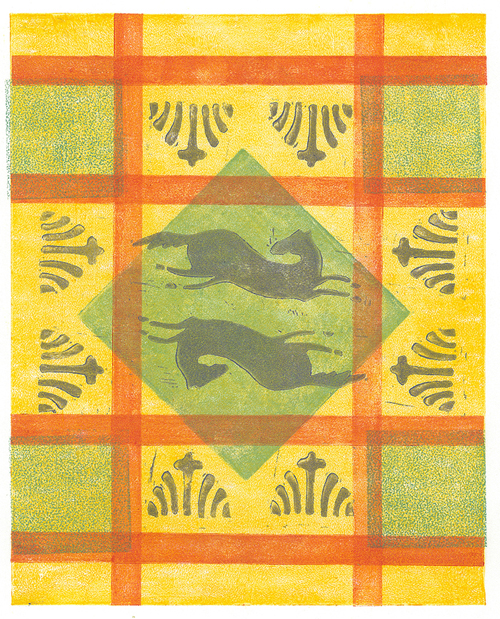
Running Horse Plaid


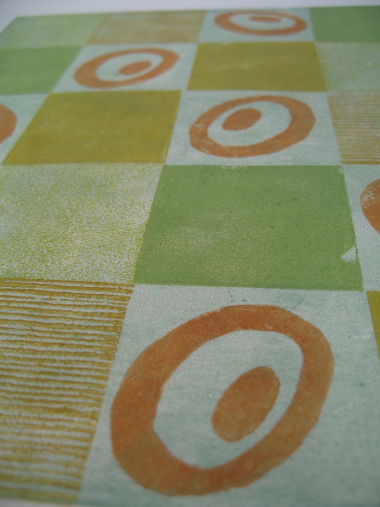
As a bit of a break from working on my large blocks for the quilt prints, I have printed up a number of smaller images based loosely on imaginary fabric patterns. This has also given me the opportunity to play around with transparent inks, which I have rarely done. I find my Daniel Smith transparent base absolutely impossible to work with. I think I should talk to someone at DS about that. My other DS inks are great, so why isn't this one??

So, for the moment, I am trying out Setswell Compound. It makes the ink feel really greasy and it takes ages to dry, but the colours become very transparent. There is also a bit of a problem with ink 'squish' around the edges of the blocks, but who said life was perfect.

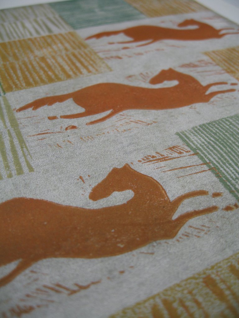
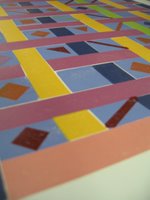
The Running Horse Plaid is a pretty jaunty little print. Well, it is not that small - 8"x10"image size - on BFK Rives Lightweight paper. I have all sorts of small blocks, so I sifted through them and came up with the ones I used for this print. OK, I did have to make the long blocks (printed in orange here). There was nothing particularly planned about this print. I just laid down the background yellow and then positioned various blocks on top of it until I had an idea of what I would print next. The colours were actually quite random as well. I had little smidges of ink saved from my quilt proofs and I just used those, watered down immensely with the Setswell.

All in all, not a bad print - to my mind. It makes me think of a sunny kitchen, with this pattern on an old piece of oilcloth on the kitchen table. Part of an imaginary childhood out of a storybook I suppose. But the print is real, so who is to say that that kitchen didn't exist sometime, somewhere.

Friday, November 24, 2006

West German Vases


A couple of years ago I bought a small vase made by Scheurich in West Germany. It has a vermilion underglaze and a black lava glaze on top in a spider web pattern. The form is very simple, but I find the piece is stunning. This vase made me take a closer look at West German vases from the sixties and seventies and I found an awful lot to like. The modern forms, the interesting colour combinations - lots of browns, reds, turquoises and then all of the textures in the glazes captured my attention.


I decided I would have to try and recreate those glaze textures in print form and so I started to print vases. I have now editioned five vases and the two shown here are my current favourites. Someday I will make a print of the one I actually own!

Vase No. 26is available for sale here.

Thursday, November 23, 2006

The Rayon Dress Quilt: Work in Progress


One of my grandmother's quilts originally looked very un-quilt like to me. It is made up of very slippery fabrics and is very light weight. A summer weight quilt I suppose. My impression of quilts was that they were always heavy and made of wool. So I wonder where these fabrics came from? I doubt there is anyone left who can actually answer that question. So I have guessed and called it the Rayon Dress Quilt.

My blocks are all completed and I started the proofing a couple of weekends ago. Some of the colours in the quilt are quite faded so I started the proof in brighter, fresher versions of those colours and I will see where that gets me.

Most of the blocks are multi colour,so it means mixing up a whole batch of different colours and then finding enough small brayers for the inking. I think the fourth block has seven colours on it. The upper photo is the proof after printing two blocks and the lower photo is the proof after printing four blocks. One more block to go and then I'll see what I think of the result. I'm getting a feeling that I will want to make changes. So far the print looks too smooth, not like material at all. I know what I have to do to fix that, but it means making two more blocks. Or maybe three.
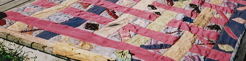
The bottom photo is a portion of the actual quilt which now looks every inch its age. It has faded over time. Parts of it are ripped. Some of the fabrics seem to have streched at different rates, so some are flat and some are bubbly. But in spite of the toll that time has taken, it retains a wonderful sense of fun and whimsy. The colours are a little bit riotous. The stripes start and stop just as they please. The crossed x's and diamond patterns wander randomly across the surface. And yet, the finished quilt is a whole jumble of fun. If this was an unplanned pattern, it sure as heck worked.

Friday, November 03, 2006

Printing My Grandmother's Quilts


My father's family comes from Cape Breton in Nova Scotia and my grandmother made quilts for all the beds in the farmhouse. There were winter weight quilts and lighter summer quilts. Many of these old quilts are still left on the farm and when I was there this summer I took pictures and made sketches of 17 or 18 of them with a view to making prints based on their designs.

I started with the quilt my cousin Daniel uses in his spare bedroom. The design is very plain, just a series of stripes, but the overall effect is very calm and pleasing. Most of the darker stipes are made from lightweight woolen fabrics while the very pale stripes are a loosely woven cotton fabric which appears to have been dyed in different colours. The upper photo shows a detail of the proof I pulled of the print. Some of the textural effects worked onto the blocks can be seen in the inking.